Field Map
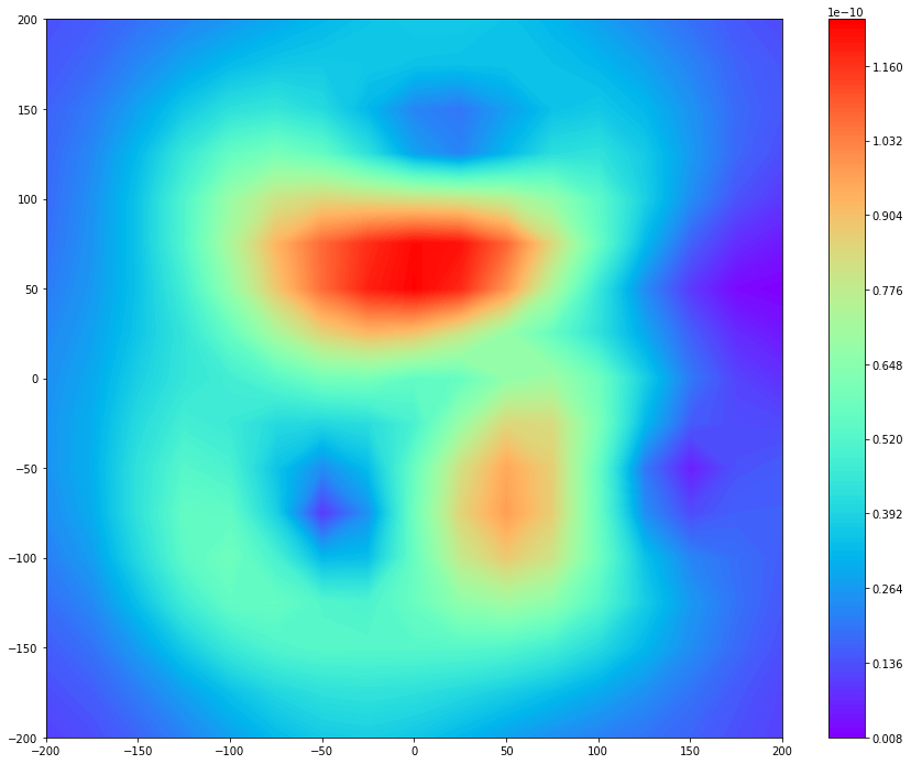
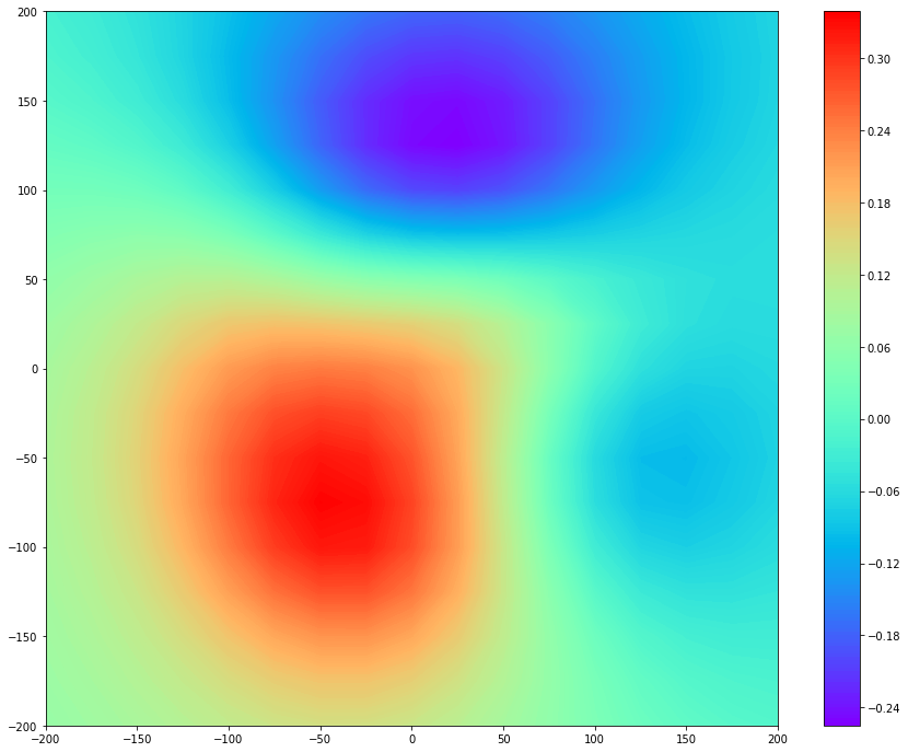
Based on multi-array magnetic information at the epoch, the field distribution can be generated. Field Map had two representation forms: Normal Field Map and Tangential Field Map. The former shows z-axis magnetic fields, in which dominant features on the plot are N and S poles. Then, it is commonly called Magnetic Field Map. The latter provides information on current density, which is obtained by the gradient of the magnetic field map. Therefore, it is called the pseudo-currents. The high magnitudes, i.e. red spots on a plot, mean electrically activated regions.
This page shows how to make a field map plot with randomly generated datasets by numpy.
Normal Magnetic Field Map
>>> from mcgpy.timeseries import TimeSeriesArray
>>> from mcgpy.numeric import FieldMap
>>> import numpy as np
>>> source = np.random.random((64,1024))
>>> positions = [(x,y,0) for x in np.linspace(-240,240,8) for y in np.linspace(-240,240,8)]
>>> directions = np.vander(np.linspace(0,0,64),3)
>>> dataset = TimeSeriesArray(source=source, positions=positions, directions=directions, t0=0, sample_rate=1024)
>>> epoch_dataset = dataset.at(0)
>>> Bz = FieldMap(epoch_dataset)
>>> import matplotlib.pyplot as plt
>>> fig, ax = plt.subplots(figsize=(15, 12))
>>> ctr = ax.contourf(Bz.X, Bz.Y, Bz, 200, cmap='rainbow')
>>> cbar = fig.colorbar(ctr)
>>> plt.show()
Tip
The area of the actual sensor arrangement is bigger than the virtual sensor grid zone.
Tangentail Field Map
>>> from mcgpy.timeseries import TimeSeriesArray
>>> from mcgpy.numeric import FieldMap
>>> import numpy as np
>>> source = np.random.random((64,1024))
>>> positions = [(x,y,0) for x in np.linspace(-240,240,8) for y in np.linspace(-240,240,8)]
>>> directions = np.vander(np.linspace(0,0,64),3)
>>> dataset = TimeSeriesArray(source=source, positions=positions, directions=directions, t0=0, sample_rate=1024)
>>> epoch_dataset = dataset.at(0)
>>> Bz = FieldMap(epoch_dataset)
>>> I = Bz.currents()
>>> import matplotlib.pyplot as plt
>>> fig, ax = plt.subplots(figsize=(15, 12))
>>> ctr = ax.contourf(I.X, I.Y, I, 200, cmap='rainbow')
>>> cbar = fig.colorbar(ctr)
>>> plt.show()